
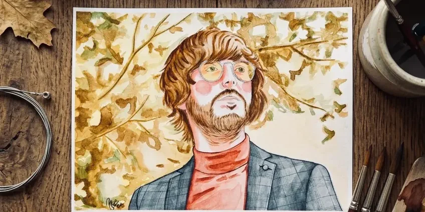
Every custom portrait I paint starts in the same place: not on the paper, but in the photo you send me. That's why, before I even pick up the brush, I always take my time reviewing the reference — and it's also the question my clients ask me most often: "which photo should I send you?" Here's the long answer, with everything that really makes a difference.
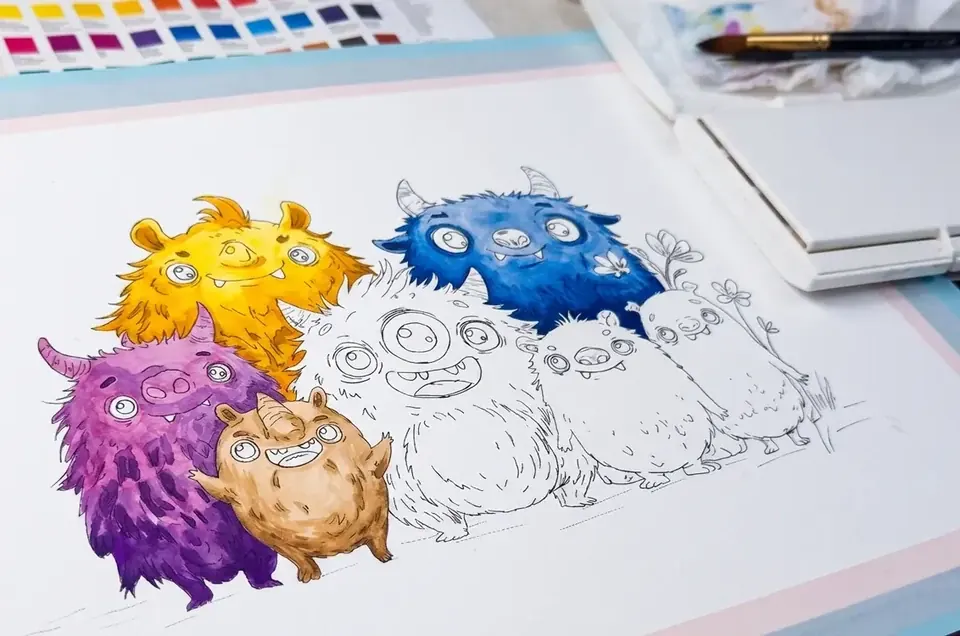
The line wash technique demands a clear reference because both the pencil underdrawing and the ink line that follows depend on seeing it precisely. If the photo is dark, blurry, or taken from an odd angle, that uncertainty carries straight through to the paper. A good reference, on the other hand, gives me the freedom to focus on what really matters: capturing the gesture and the gaze, not guessing where the nose is.
Light, above all else. Look for soft, natural light, front-on or slightly to the side — the light from a window on a cloudy day is practically perfect. Avoid direct flash, which flattens the face and erases the volumes I later translate into watercolor shadows, and avoid backlighting too, which darkens exactly the area I need the most information from: the eyes.
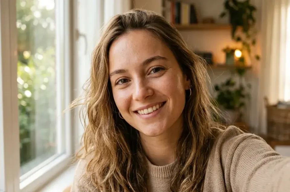
Framing and angle. A photo taken slightly above eye level, close to face height, tends to give the most flattering result and the easiest to paint naturally. Very high or very low angles distort the proportions — fun for a selfie, tricky for a portrait you want to hang on the wall.
Resolution matters more than it seems. I paint by looking closely at the detail: the highlight in the pupil, the texture of the hair, the shadow under the chin. If the photo comes from a WhatsApp screenshot or a heavily zoomed-in crop, that information is lost before I even start working. Whenever you can, send me the original file straight from the camera or phone, uncompressed and uncropped.
A clear reference photo doesn't take work away from me — it lets me invest all of it in the line and the color.
For pet portraits, the extra challenge is patience: open eyes and a natural posture matter more than the perfect pose. I usually ask for several photos from the same session so I can choose the best expression without losing the light or the framing.
If it's a couple's or family portrait, try to make sure every face gets similar lighting — a photo where one person is in the shade and another in full sun forces me to "invent" lighting, and it always shows. And if you're torn between several photos, send me all of them: I'd rather take my time choosing than work from a reference that doesn't quite convince you.
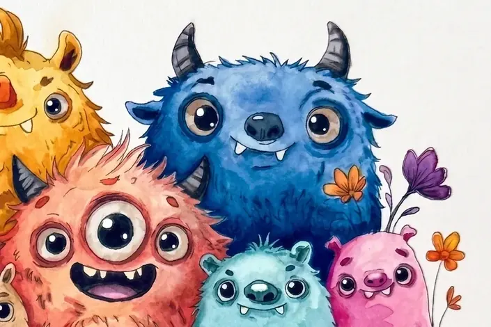
With these points covered, the rest is up to me: finding the exact balance between the ink that holds the structure and the wash that brings it to life. If you're unsure about a specific photo, send it to me on WhatsApp before you commission the piece — I'll tell you, no strings attached, whether it works.